A case-study portfolio, built page by page from scratch
This is the site you're reading right now. It's a multi-page personal portfolio built to present detailed case studies - manufacturing operations, product strategy, analytics and engineering work - in a consistent, readable, recruiter-friendly format, without relying on a website builder or a JavaScript framework.
The brief was self-set: every project needed its own full case-study page and a place in a filterable index, the whole thing had to feel like one coherent product rather than a stitched-together set of documents, and it had to load fast and work cleanly on a phone in a train station as well as a laptop at a desk.
One shared shell, many independent case studies
Plain HTML, CSS and JavaScript - no build step
The design system runs on CSS custom properties (color, spacing and type tokens shared across light and dark section variants), a single Inter type family from Google Fonts, and reusable component classes (section-block, index-row, feat-list, outcome-row, tech-badge) so every case study looks native to the site instead of pasted in.
Interaction is handled by one shared vanilla JavaScript file: a custom cursor that follows the pointer with an eased requestAnimationFrame loop, scroll-triggered reveal animations via IntersectionObserver, a scroll-aware navigation bar with active-link tracking, and a mobile hamburger menu - all DOM lookups guarded so the same file runs unmodified on pages that only use a subset of these elements.
The project index uses a lightweight category filter (data attributes + class toggling, no framework), and the CV/contact capture flow is wired to Web3Forms as a serverless form endpoint, so there's no backend to host or maintain.
"The constraint was deliberate: no framework, no bundler, no dependencies to keep patched. Just files that open in a browser and still feel designed."
Keeping every page consistent without a framework
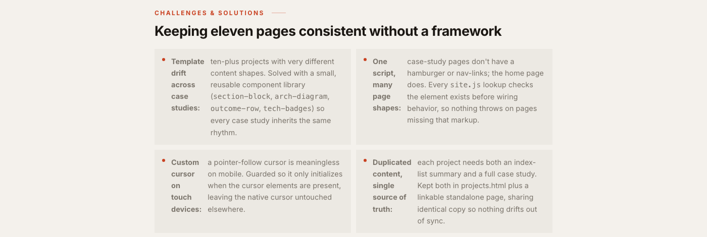
section-block, arch-diagram, outcome-row, tech-badges) so every case study inherits the same rhythm.site.js lookup checks the element exists before wiring behavior, so nothing throws on pages missing that markup./images directory with consistent naming so pages stay lightweight without image-pipeline tooling.Confirmed on real widths, not just assumptions
Every page was served from a local static server and driven with headless Chrome rather than checked by reading code alone - full-page screenshots at desktop width against the rest of the site, then a responsive sweep across the site's own breakpoints (≤1024px, ≤960px, ≤540px, ≤480px) from small-phone widths up to a 1440px desktop, with an automated check comparing the document's scroll width to the viewport width to catch horizontal overflow.
document.documentElement.scrollWidth checked against viewport width at each size - zero horizontal overflow confirmed.<strong> and <code> tags inside a display:flex row caused each inline tag to become its own flex item, fragmenting the layout. Fixed by wrapping the trailing content in a single <span>, matching the pattern already used elsewhere on the site.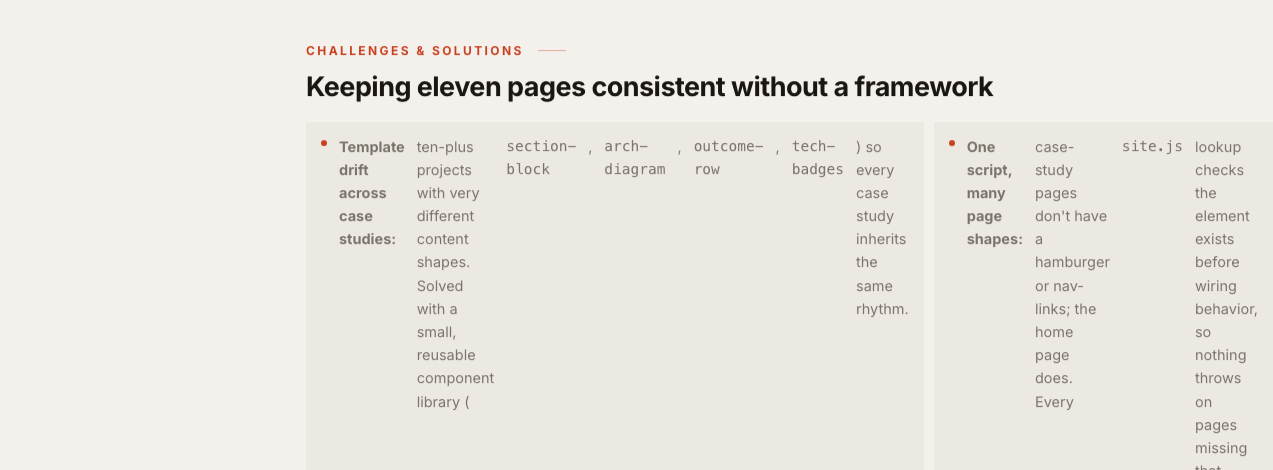

Go beyond the overview. Explore the complete project documentation, process, and supporting files on GitHub.